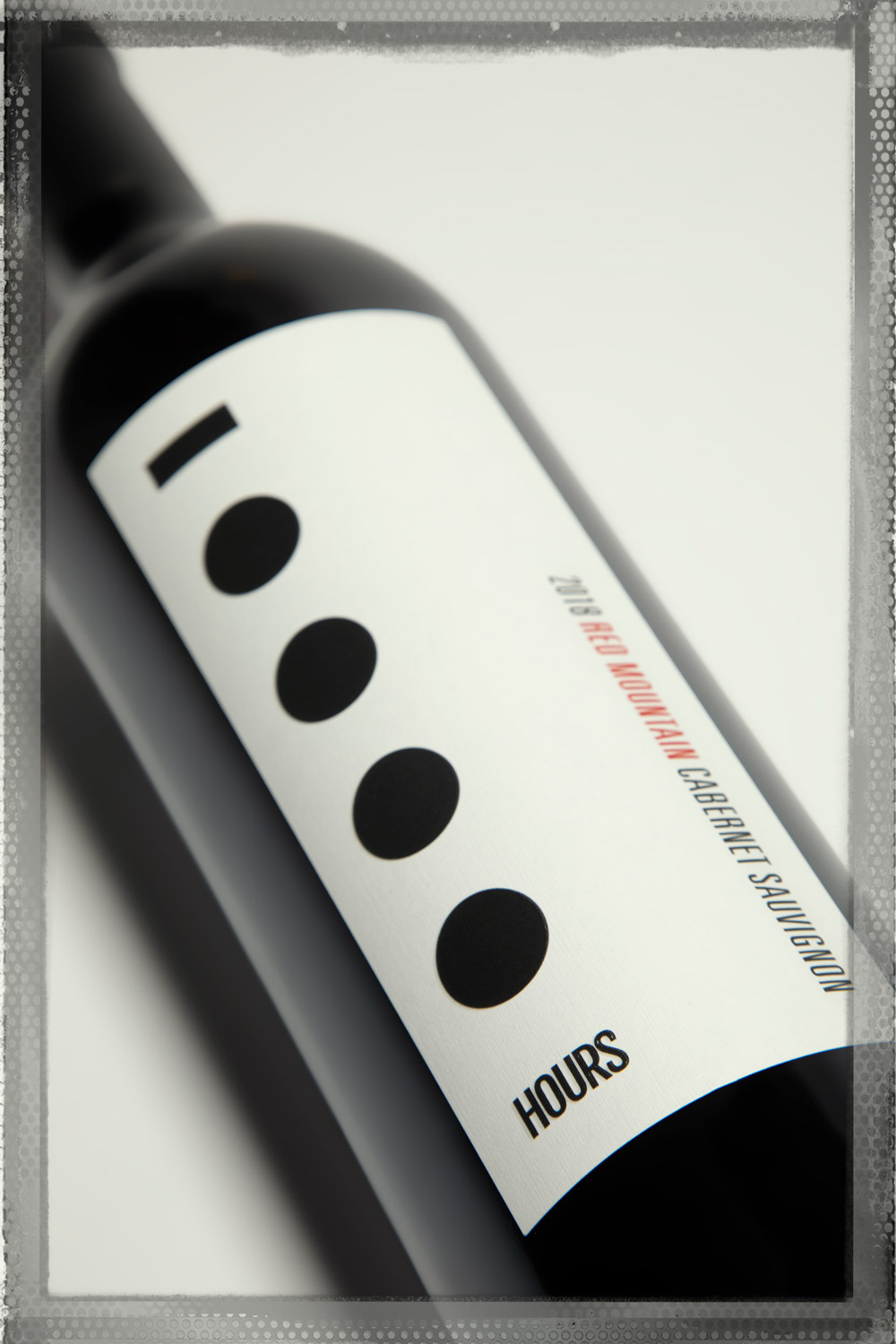
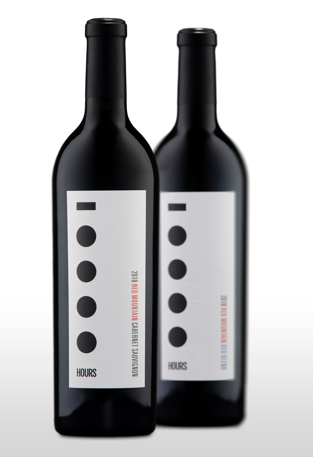
10,000 Hours
Today, a single trip to most any grocery store illustrates why designing a wine label is a bit like designing a needle in a haystack, with the goal of making that needle stand out in all that straw. Not an easy task.

For 10,000 Hours, we kept it simple, bold and elegant (like the wine itself) but also unusual enough to garner attention among the hundreds of other bottles that surround it, everywhere it’s typically displayed and sold.