Fisk Alloy
Fisk attends a number of industry trade shows annually. Unfortunately, these brand touch points were missed opportunities because of the significant dissonance between their highly-engineered products and the image their old booth graphics projected.
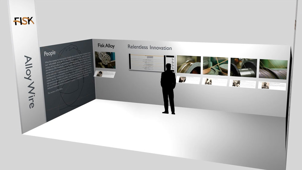
Our original design, for Munich in 2012, was modular — designed to conform to the layout and structural guidelines of all the major trade shows in the industry. Its primary purpose: to introduce Fisk Alloy to a global audience, presenting their credentials and capabilities to prospects largely unfamiliar with Fisk. Perhaps the most dramatic component —and certainly the one that received a steady stream of attention — was a display within which copper source material and some of the resulting engineered products were presented. The wall-mounted case included built-in magnification to reveal the ultra-fine stranding of Fisk’s Percon line of wire — some of which are thinner than human hair.
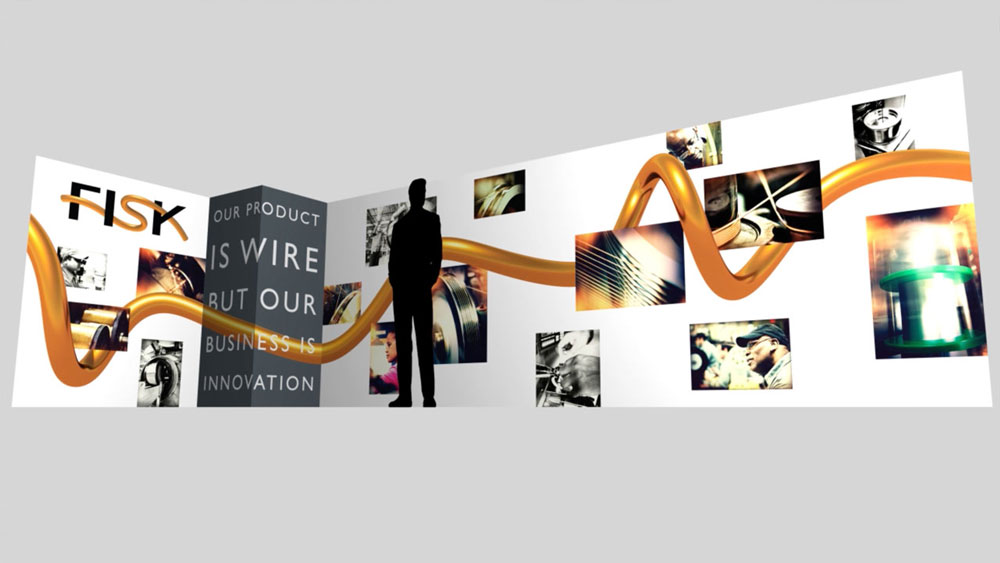
An evolution of this booth has recently debuted at Wire Düsseldorf. The focus has shifted from an introductory tone to demonstrating category leadership and highlighting news.


