Zane
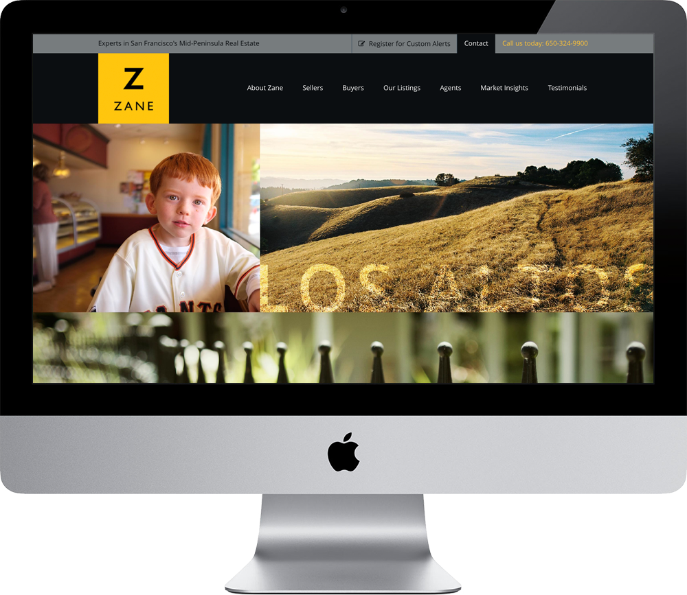
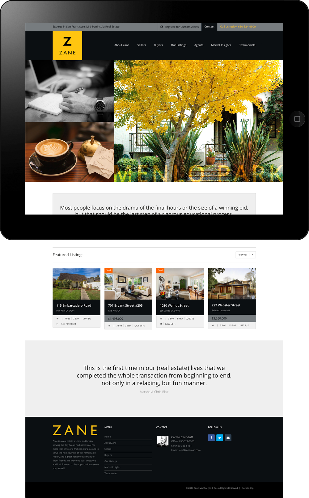
Zane’s website design represents a distinct departure, not only from what they’d done before, but from their competition. There’s a mystique about living on the Peninsula, in particular Palo Alto. So much so that many are willing to pay almost unheard of premiums for the intangibles associated with the right address. To us, this is what Zane is actually selling; not just homes but what it’s like to live here — from the startup, Sand Hill Road, new new thing lifestyle, to the ride-your-bike-to-work, breeze the horses, great place to raise your kids paradise.
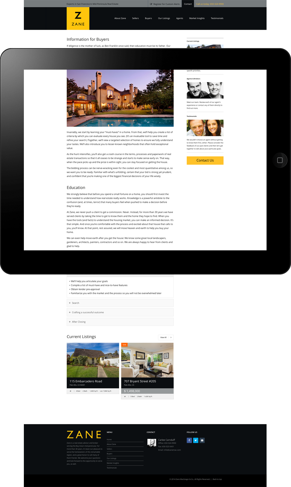
Thus, while providing the functionality and information prospective home buyers and sellers are seeking, we colored the presentation with images of life on the Peninsula; a mix of its cutting edge, up-tempo, urbane culture and the peace and arid beauty of its majestic undulating hills. This unique brand presence underscores the difference between Zane’s approach to real estate brokering, and that of their most worthy competition.


