Concours d’Elegance
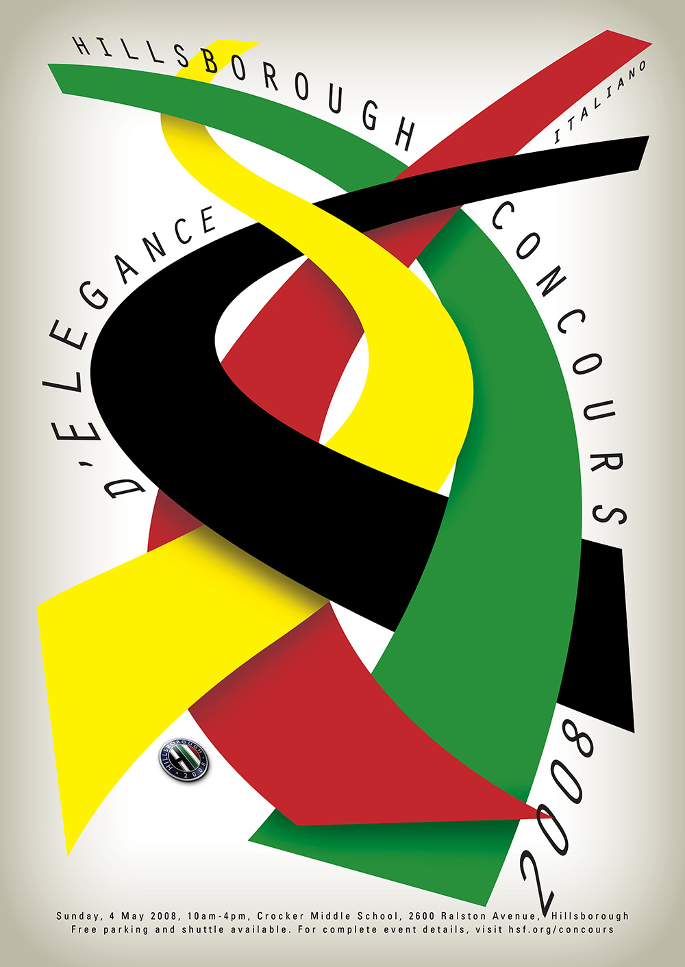
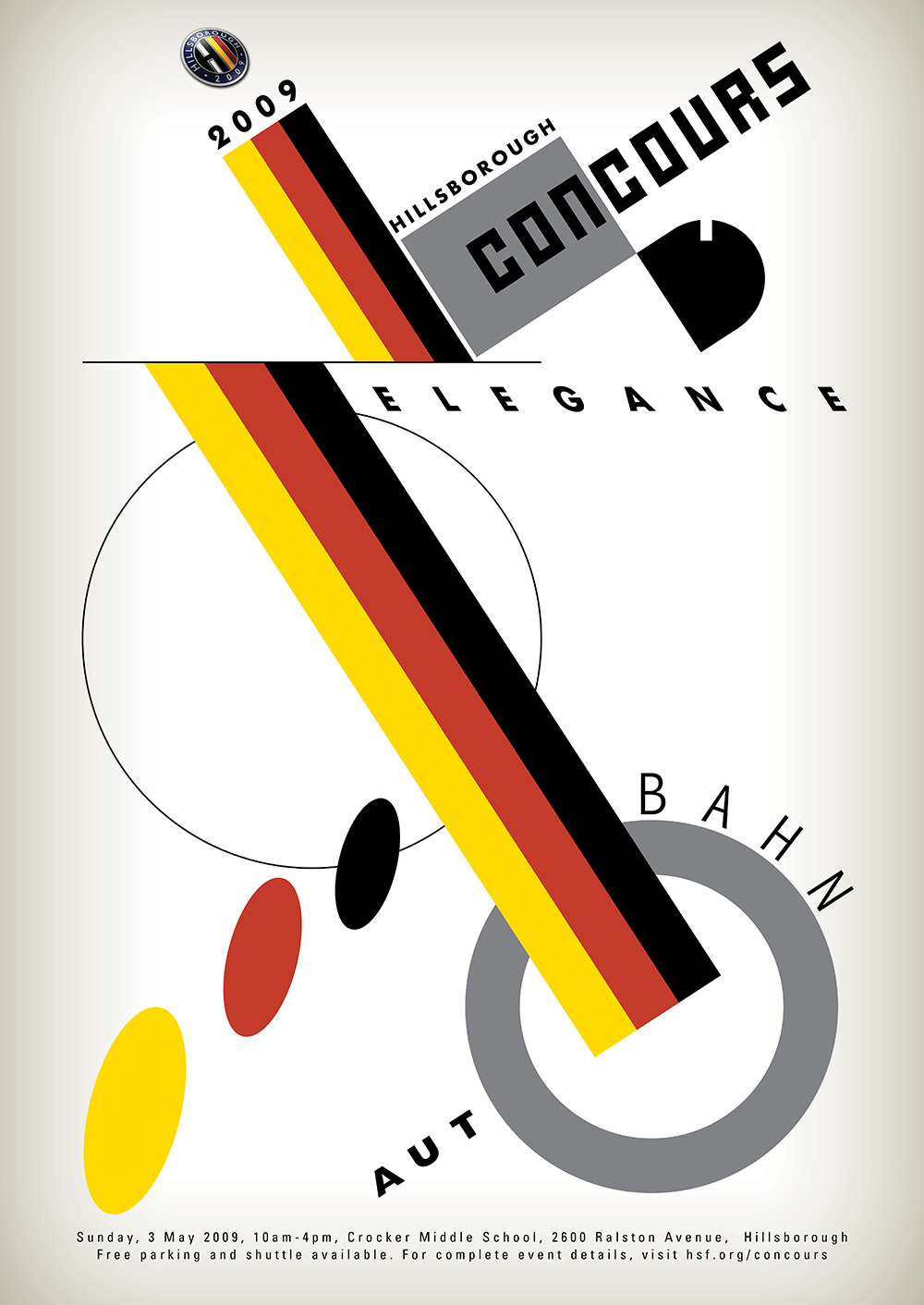
Hillsborough’s Concours d’Elegance is dominated by sleek, beautiful, vintage automobiles. Thus, we found inspiration for our show posters in the vintage (and equally sleek) avant-garde typography movement of Central Europe in the 20s and 30s, and aligned each year’s theme with the country of focus. This direction yielded designs that clearly distinguish the Concours d’Elegance from the competing shows in Pebble Beach and Palo Alto, while also creating a unified approach year-to-year.


